Project Description
Sphera
Laying the UX Foundation
What do you do when a company desperately needs UX discipline but at the same time has difficulty embracing any UX practices? Covert operations, skunkworks projects, and lots of flexibility of course!
When I joined Sphera in mid 2018, it was a company that recognized that it sorely needed to improve the UX of its software but at the same time had neither any idea how to begin nor any notion of how to actually work with UX professionals. This lack of understanding manifested in confusion and frustration at best and full on delays and missed opportunities at worst. To overcome these roadblocks, several strategies were run simultaneously.
The battle plan to transform Sphera into a UX power house included the hiring of a motivated team of professionals, the development of a central guiding UX framework, the authoring of a verbose and robust UX style guide and design system using atomic design, and strategic insertion and evangelization of UX practices at key (and often unexpected) places.
ROLE
UX Lead
UX TEAM SIZE
4
SKILLS NEEDED
Leadership, Administration, Technical Writing, Research, Wireframing, & Prototyping
SOFTWARE USED
Sketch, InVision, Abstract, Zeplin, Balsamiq, Photoshop, Azure DevOps
DATE
2018-2020
DURATION
Two Years
First, We Needed a Team
IF YOU COULD ONLY HIRE ONE UX PERSON, WHO WOULD THEY BE? WHAT ABOUT TWO? THREE?
One of the most common questions I’m asked by growing companies is “if we can only hire one UX person, what role should it be?” I break it down thusly:
If you can only hire…
One: A generalist with strong Interaction Design (IxD) competency if not a full on IxD
Two: Another generalist with strong Visual Design (VxD) and research skills.
Three: Depending on the company’s needs and/or appetite for research, either a dedicated VxD or a dedicated researcher
Four: Whichever role wasn’t hired in the previous step
Five: Again, depending on the company’s inclinations, ideally another dedicated researcher. If not, then another dedicated IxD.
Once you get to four or five, it’s time to start thinking about seniority and more segregated specialization, but that’s beyond the scope of this case study. For Sphera, I needed a team that could simultaneously untangle the mess of several disparate legacy products while simultaneously collaborating on foundational collateral. We inherited a fantastic senior level VxD from an acquisition and the budget allowed for two additional hires: ultimately a senior level IxD with an associate level generalist fresh out of a UX boot camp. This handpicked team was perfect for the challenges we faced at Sphera.
Final Team Composition
UX Framework
WITHOUT A ROBUST FRAMEWORK, WE ARE LOST
One of the first tasks at Sphera, even before I was able to hire additional resources, was to start understanding the disparate legacy products in order to bring them together under a central platform. The best place to start such a task is with heuristics evaluations but for those to be as effective and objective as possible, it was necessary to make a kind of rubric. This came in the form of the UX framework which would become central to the UX style guide that was to follow.
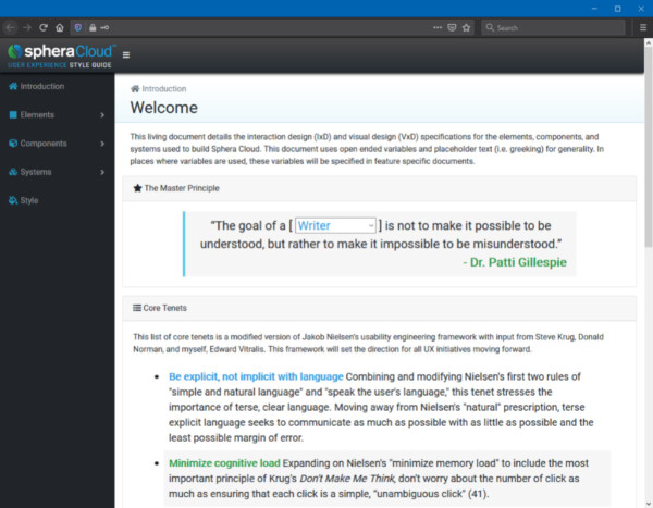
To the right is the framework I put together to guide Sphera along its journey toward UX best practices. The list of core tenets is a modified version of Jakob Nielsen’s usability engineering framework with additional input from Steve Krug, Donald Norman, and myself.
UX Style Guide
Building on the initial UX framework, next came what is arguably my most important piece of work during my tenure at Sphera. The Sphera Cloud UX (SCUX) Style Guide served as a central repository for all things UX at Sphera. It included:
- The UX framework
- Leveraging atomic design principles, verbose descriptions of each element, component, and system detailing when and how to and not to use each
- Visual examples of each element, component, and system
- Code snippets and construction guides for each element, component, and system
- A style section comprising language usage, colors, iconography, and fonts
- An appendix containing further information for those interested in learning about UX
To the left is a link to a deprecated early version of the style guide which was created in HTML, PHP, CSS, and JavaScript by me before the rest of the team was hired. Since then, the style guide was migrated to to SharePoint to allow collaborative editing with my UX colleagues.
The SCUX Style Guide was based heavily on IBM’s Carbon Design System as it is the single best system I’ve found to use as a base for enterprise level software. Unlike the trendier Material Design, Carbon is much more accommodating of real-world cases involving big data sets and obnoxiously large numbers of records. Material Design, on the other hand, tends to be much more tuned for smaller, idealized boutique apps.
Sketch Design System
PIXEL PERFECT ASSETS FOR RAPID
HIGH FIDELITY WIREFRAMES
With a team assembled and an IxD heavy style guide in place, it was time to churn out pixel perfect VxD (i.e. UI) for all of the elements, components, and systems used in any new development moving forward. The the bulk of this work fell on our Senior Visual Designer, but after the initial layout was created, we were all able to contribute and update the library individually.
We streamlined our production pipeline thusly. First, an entire robust controls library was created for use in Sketch. Concurrent development was made possible using Abstract, which is version control software specifically for Sketch files. Once designs were finalized in Sketch, they were sent to InVision to demo functionality to various stakeholders then ultimately exported to Zeplin, which provided the development teams with all the detail they could possibly need to build the controls exactly as designed.
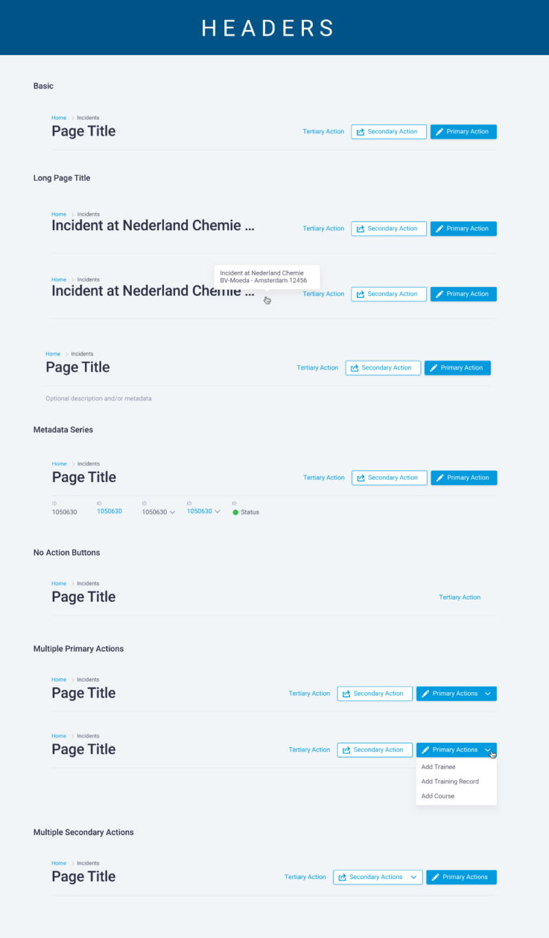
Below are a few selected exports from the design system file to showcase the visual design.
UX Evangelism & Alternative Research Methods
WHEN LIFE HANDS YOU LEMONS…
As mentioned in the very beginning, Sphera was in dire need of some UX discipline. However, they were at the same time highly resistant to suggestions, especially when it came to research initiatives. As quantifiable user research is central to any reasonably competent UX team, we needed to find way both to change the minds of the leadership team and find non-traditional ways of gathering the all important voices of the customer. To do this, we embarked on a two-fold mission of UX evangelism and alternative research tactics.
UX evangelism took place in many ways. In addition to the major deliverables described above, we gained traction in other ways. Firstly, by providing useful assets and consulting input to the development teams, we were able to quickly help them understand that while we were ostensibly taking away some of their decision making power when it came to design decisions, they were in turn receiving a substantial boost in productivity as their time could be focused solely on programming instead of designing. This additional productivity more than made up for the “additional asks” that UX teams are often notorious for bringing to development teams.
In addition to ingratiating ourselves upon the developers on an everyday level, we also prepared a presentation to the company as a whole to explain what it is that UX does, what it doesn’t do (UX is not simply putting “lipstick on a pig”), and how best to work with us. You can view a pared down version of our presentation to the right (with personal information redacted for privacy).
Lastly, we found our research efforts stymied often, given flawed (but common) excuses such as “there isn’t time, we’re losing customers” (yet we don’t know what they even need), “if the users even get a hint that we might change something, they’ll panic!” (if we’re actually losing customers, wouldn’t they be excited to see that we’re making improvements?), and “we can’t change how it works, just make it look modern” (that won’t actually solve anything in the long run). Thus, encountering resistance when pushing for a traditional UX research plan, we started figuring out alternative ways to get what we needed.
One of the most helpful resources we found came from the sales team, who kept a record of every lost sale and the given reason why. While this hardly constituted a scientifically valid study, it at least gave us a place to start. That information, paired with traditional competitive analysis through heuristics evaluations gave us an idea of the places where our software was lacking in the broader scheme of the market. Armed with that information, we requested to sit in on any demo or interactions with users we could. Afterword, we would give suggestions on ways to ask better questions and started volunteering to help prep for upcoming sessions. Eventually, the UX team took over running the sessions entirely and we were able to get invaluable feedback directly from users.
Conclusions
THE PATH ISN’T ALWAYS CLEAR
BUT THERE IS ALWAYS A WAY FORWARD
When a company has trouble understanding the value of UX but expects miracles anyway, sometimes you just have to get creative. Through the above foundational work and alternative research methods, we were able to uncover the users’ real needs, improve NPS scores, and increase the number of story points development could tackle each sprint. It’s critical not to give up. After all, the fun is in the challenges.
Case Studies
Check out the case studies below
or visit my full portfolio for additional UX and non-UX related work
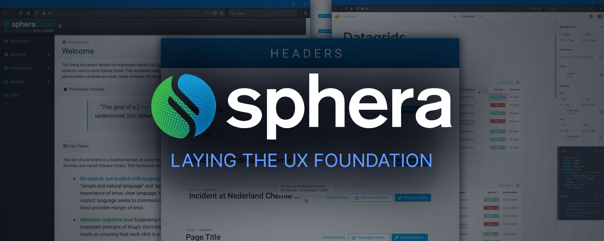
Sphera – Laying the UX Foundation
Leadership, Administration, Technical Writing, Research, Wireframing, & Prototyping
How I laid the foundations for a robust UX department by building a team and creating a UX framework, style guide, and design system.
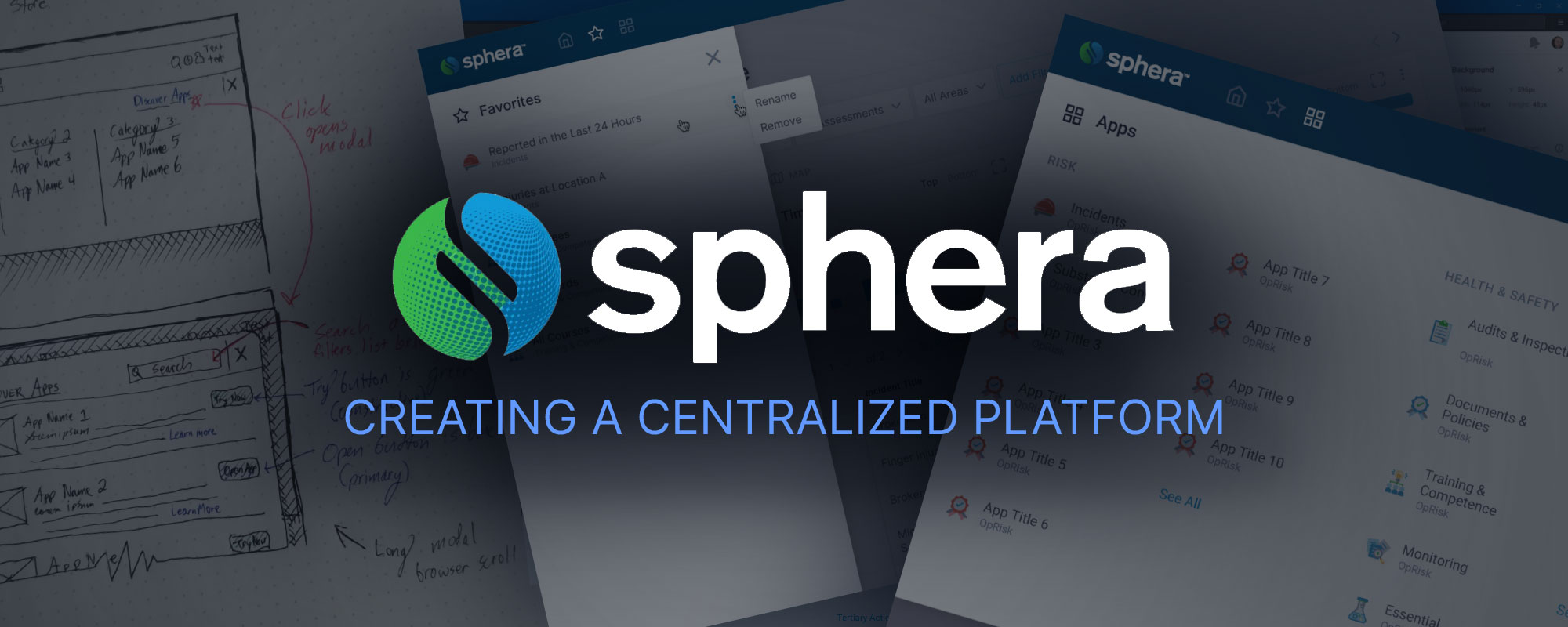
Sphera – Creating a Centralized Platform
Leadership, Research, Wireframing, & Prototyping
Working from the design system and foundations laid here, I lead my team to create a central platform to unite all of our disparate product offerings in the cloud.
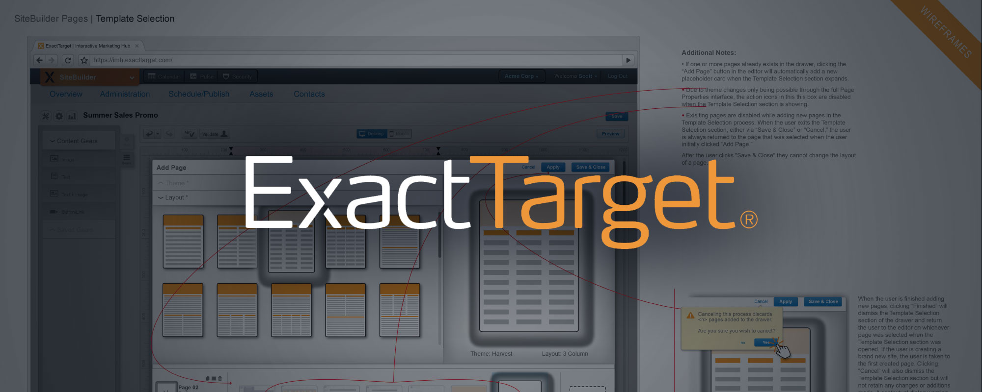
ExactTarget – Site Builder App
Research, Wireframing, Prototyping, & Teamwork
As part of a well-established team with a robust design system, this case study showcases my portion of the interaction design and creation of a website builder app from ideation through prototyping.
Insite360 – Streamlining the AVA Process
Research & Wireframing
Wrangling a suite of tremendously complex business products to play nicely together including defining metrics and business outcomes as well as designing an elegant unified cloud based experience.
