
Project Description
Sphera
Creating a Centralized Platform
When I started at Sphera in 2018, I was brought on as part of the platform team to assemble a squad of UX professionals with our largest goal being to create a central platform to unite all of our disparate product offerings.
This was a monumental task for several reasons. Firstly, Sphera’s software had layers upon layers of legacy code (including some written in Fortran!). These layers were spread amongst several disparate products (many of which were on-prem (i.e. installed locally)). In addition to being developed in different eras, a few UI improvement initiatives had been attempted throughout the years so there were several different versions of the UI even within the same products. Additionally, Sphera made five acquisitions (four of which happened after I joined) since 2017, each with their own suite of software facing similar issues as Sphera’s already complicated suite.
To further complicate the matter, Sphera as a company was resistant to invest in proper UX research strategies. This forced my team and I to use alternative research methods in order to provide our best educated guesses for controls and paradigms that would be best understood by our widely varied user base.
ROLE
UX Lead
UX TEAM SIZE
4
SKILLS NEEDED
Leadership, Research, Wireframing, & Prototyping
SOFTWARE USED
Sketch, InVision, Abstract, Zeplin, Balsamiq, Photoshop
DATE
2018-2020
DURATION
Two Years
The Mess Defined
WHEN THERE’S SO MUCH TO UNTANGLE
IT’S SOMETIMES DIFFICULT TO KNOW EVEN WHERE TO START
Sphera, as a company, has a complicated history and some of its legacy code reaches all the way back to the early ’90s. Nearly every company that’s been around a while has experienced the pain of trying to migrate desktop software to the cloud. Even companies that started in the SaaS era have often experienced difficulties with some of their solutions not playing nice with modern browsers or lacking any semblance of reasonable user friendliness. Sphera was no different.
In an attempt to solve this problem, Sphera acquired Rivo in 2017 in the hopes of using that as their central platform to house all of their disparate software solutions. During this time, legacy products were converted to the Rivo interface while at the same time, a brand new UI initiative was launched in an attempt to also update Rivo’s aging visual design. Unfortunately, these initiatives did not do much to improve the interaction design (i.e. the UX) and only succeeded in creating further disparity within the products as only parts were updated this new UI. This was not the first time this was attempted prior to the true UX initiative.
Prior to 2018, Sphera already had three different verticals: operational risk, environmental performance, and product stewardship. With the acquisitions of Petrotechnics, SiteHawk, sparesFinder, and ThinkStep, Sphera broke into even more markets. Each of these acquisitions brought along additional pieces of disparate software, each with their own user flows and interfaces (some even with several), to the already complex problem of making them all play nice together.
At a Glance
Taking Inventory
UNDERSTANDING & SORTING ALL THE OFFERINGS
As mentioned in the Laying the UX Foundation case study, one of the first tasks was to start understanding and organizing the disparate legacy products. This was accomplished through internal training, consultation with our subject matter experts, UX heuristics evaluations, and finally through team discussion. The heuristics evaluations were divvied up amongst the team and used the UX framework as a guide. We combed through the software, noting anything that violated best practices, tying each deviation to one of the core tenets. This let us get a rough quantitative idea of the most common types of issues as well as help us understand the software and user flows in general. For reference, a link to the UX framework I put together for the team can be access via the button below.
Once we completed the heuristics evaluations and all had a rudimentary understanding of how each product worked, we met as a group to sort the products based on their purpose and overlapping functionality. We also considered input from marketing with regard to product groupings for logical sales strategies as well as brainstormed ways to combine offerings into dashboards that spanned several products (and even multiple verticals) at once.


The App Switcher
One of the most important problems to solve in this whole process was “how do we switch between apps and how is that different (or perhaps part of) the primary and secondary navigation?”
Remembering that proper UX research methods weren’t available to us, we again leaned on our internal subject matter experts, product managers, and sales colleagues for help in understanding our user base. At this point, we also did competitive analysis to see how our rivals solved this issue as well as investigated how the largest companies such as Google, Microsoft, and Adobe handle it.
There are obviously many ways to switch between different products inside of a single suite. However, Sphera’s user base is tremendously varied depending on the role and it was important to choose the paradigm that would be most familiar to the personas who would be switching between products the most.
Initial Sketches
YES, I STILL LOVE PEN & PAPER
Now that we had several ideas, it was time to start sketching out our solutions. It was important that the solution satisfy not just the users’ needs but as many of the Sphera stakeholders as possible. It was important that the user not just be able to switch between apps but also to be able to preview and ultimately purchase those they did not yet have. Up selling and cross selling elements were heavily desired by the executive leadership team.


Sketch Assets
ACCOUNTING FOR ALL THE EDGE CASES
As is common in enterprise level software, you often have to account for rare possibilities well beyond the realm of reasonable expectations. Two of the most common questions I ask are “what if there are 10,000 of them?” and “are we letting the user customize these?” Both of those questions usually lead to making the solution as flexible as possible to handle worst case scenarios.
In the case of our app switcher, we needed to account for several combinations and permutations of factors that affected what appears in the menu. Here are some example scenarios we had to accommodate:
- What if the user only has access to one or two apps?
- What about super users who have access to literally everything?
- Where do the custom entries go?
- Can the user rearrange these?
- Can a user choose to hide apps?
- What if the number of groups forces the page to scroll?
- What if the number of entries in a single group forces the page to scroll?
We ultimately had to create solutions for all of these questions along with writing precise specifications for when to use each of those solutions. Unfortunately in the end, our best ideas were scrapped in favor something quick the development team could get out the door in a hurry, but that’s the way it goes sometimes. We were still proud of the work that we did and I was proud of the team for coming together for this exercise and doing it the “right” way under adversity.
Case Studies
Check out the case studies below
or visit my full portfolio for additional UX and non-UX related work
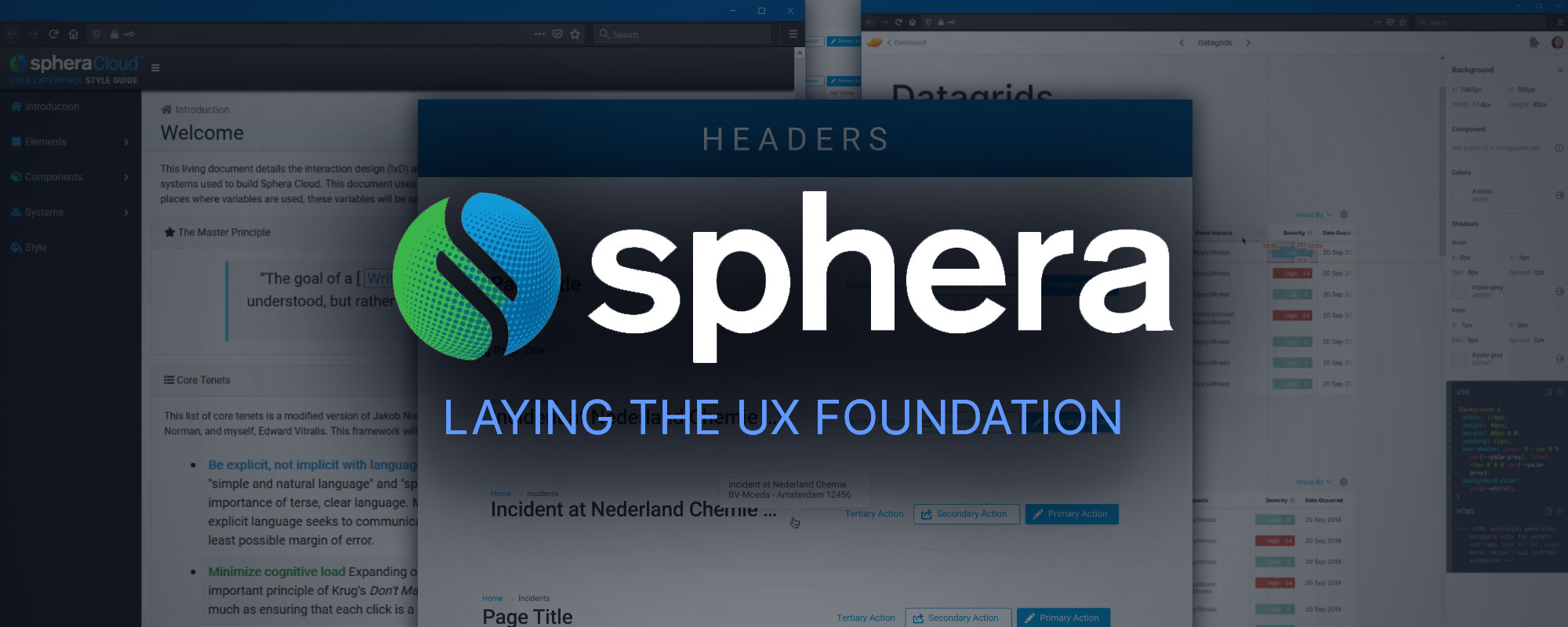
Sphera – Laying the UX Foundation
Leadership, Administration, Technical Writing, Research, Wireframing, & Prototyping
How I laid the foundations for a robust UX department by building a team and creating a UX framework, style guide, and design system.
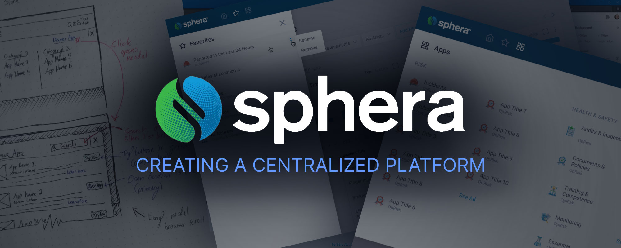
Sphera – Creating a Centralized Platform
Leadership, Research, Wireframing, & Prototyping
Working from the design system and foundations laid here, I lead my team to create a central platform to unite all of our disparate product offerings in the cloud.
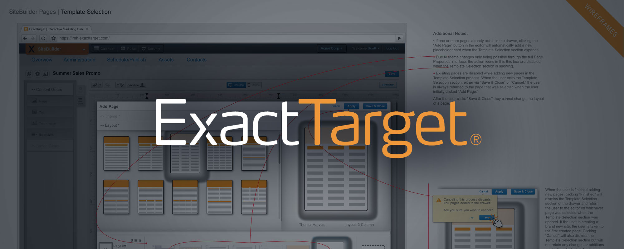
ExactTarget – Site Builder App
Research, Wireframing, Prototyping, & Teamwork
As part of a well-established team with a robust design system, this case study showcases my portion of the interaction design and creation of a website builder app from ideation through prototyping.
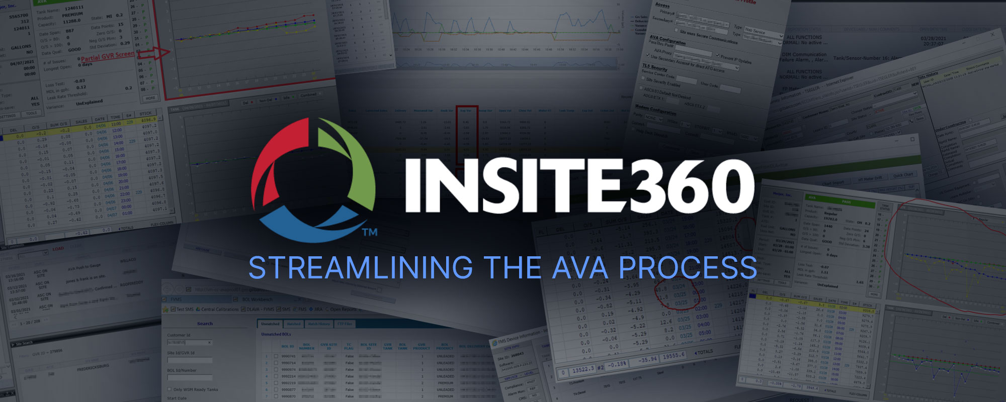
Insite360 – Streamlining the AVA Process
Research & Wireframing
Wrangling a suite of tremendously complex business products to play nicely together including defining metrics and business outcomes as well as designing an elegant unified cloud based experience.