
Project Description
Insite360
Streamlining the AVA Process
Advanced Variance Analysis (AVA) is the process to reconcile anomalous tank data in modern fueling systems. It is a tremendously complex endeavor that currently requires many pieces of disparate software to be open at one time. As nearly every piece of software requires its own separate login, contains extraneous information that isn’t relevant, and competes for screen real estate, this is substantially less than ideal. Insite360 is working with Grid Dynamics to provide a streamlined solution in the cloud.
As the UX Lead, it was up to me to carry the project from initial research of fact finding, discovery, and determining business outcomes through to the creation of wireframe solutions with both minimal and ideal feature sets. My contract ended before the software was released, however, I will describe my design process below.
ROLE
UX Lead
COMPANY SIZE
≈ 50
SKILLS NEEDED
Researching & Wireframing
SOFTWARE USED
Balsamiq, Photoshop, Excel
DATE
March – May 2021
DURATION
Three Months
The Problem Defined
MULTIPLE LOGINS, EXTRANEOUS DATA, AND A DOZEN+ WINDOWS
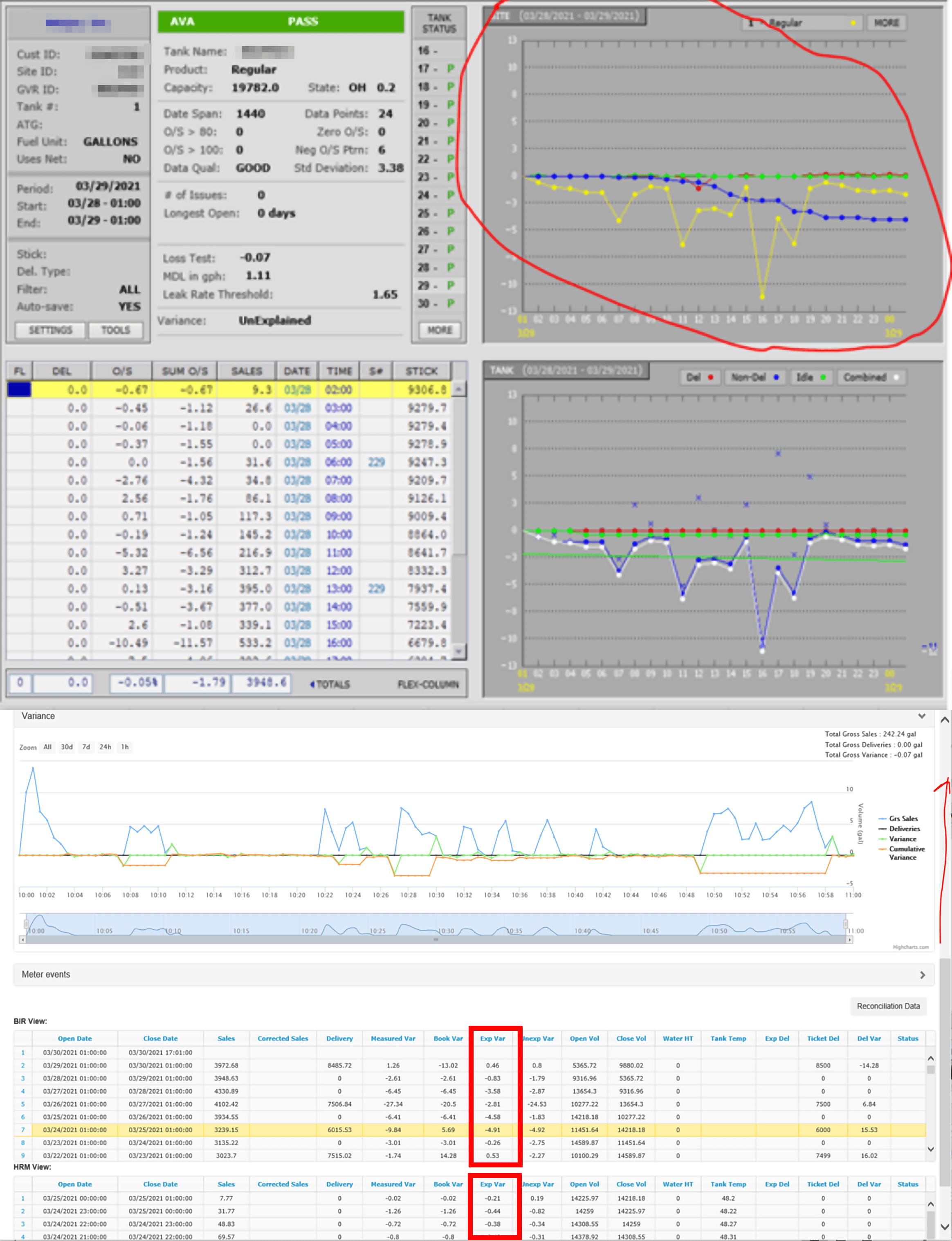
AVA is a complicated process involving comparing many different pieces of information in order to determine the cause of an anomaly in tank data. Data is correlated from many different tools including tank charts, site surveys, meter maps, the “hi-res tool,” Power BI, and others to reconcile information from tank measurements, bills of lading, invoices, fuel disbursements, and much more. While 75% of the anomalies require looking at every window, 80+% of the data in each window is unnecessary.
The Core Issues
- Seeing the needed data is difficult as there can be over a dozen different open windows
- Multiple logins are required to access the disparate tool set
- Much of the data in each window is superfluous to the vast majority of anomalies
- Some tools take up to two full minutes to load all of that extraneous data
- The software does not provide any kind of useful machine learning based suggestions to assist the analyst
Current Metrics
It’s not an insignificant amount of work
Desired Business Outcomes / Goals
These are the goals for the proposed software solution
Initial Research
After the metrics and goals were defined, the first step was to understand what each tool did and which information was necessary (and how often) from each window. This information was gathered via a combination of heuristics evaluations and extensive consultation with the analysts at Grid Dynamics. There were many video calls where the AVA process was defined, tools were explained, pain points were identified, and wish lists were created.
Low Fidelity Wireframing
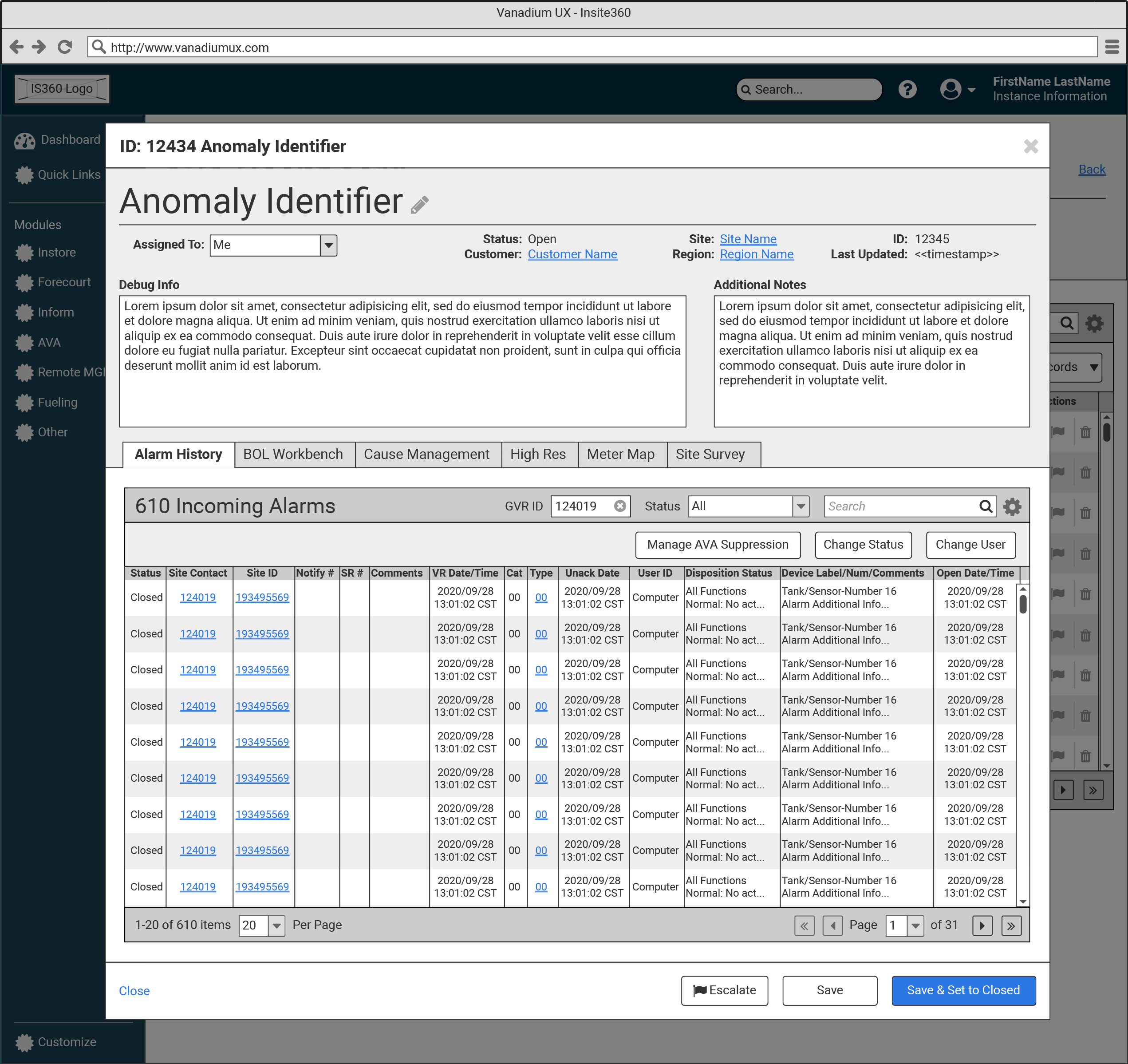
My first thought was to see if we could fit everything into a single large modal above the datagrid of anomalies and leverage tabs to reduce the number of needed windows. By putting only the most relevant information in each tab, everything was miraculously able to just fit at minimum supported resolution. In the rare cases where the user would need to access the extraneous data, they could easily open the full external tool via handy contextual links.
Balsamiq (i.e. low fidelity) was chosen both for fastest possible iteration and because the design system and UX tool set pipeline weren’t yet available at Insite360.
Data Peeking
In an attempt to solve two problems at once (i.e. the number of windows and painful loading times), the idea to be able to peek quickly into related information directly from an anomaly record was conceived. With this method, an analyst could simply hover over icons in the anomaly datagrid to quickly view information such as site, customer, or region data. This substantially reduced clicking, tabbing, and overall cognitive load.
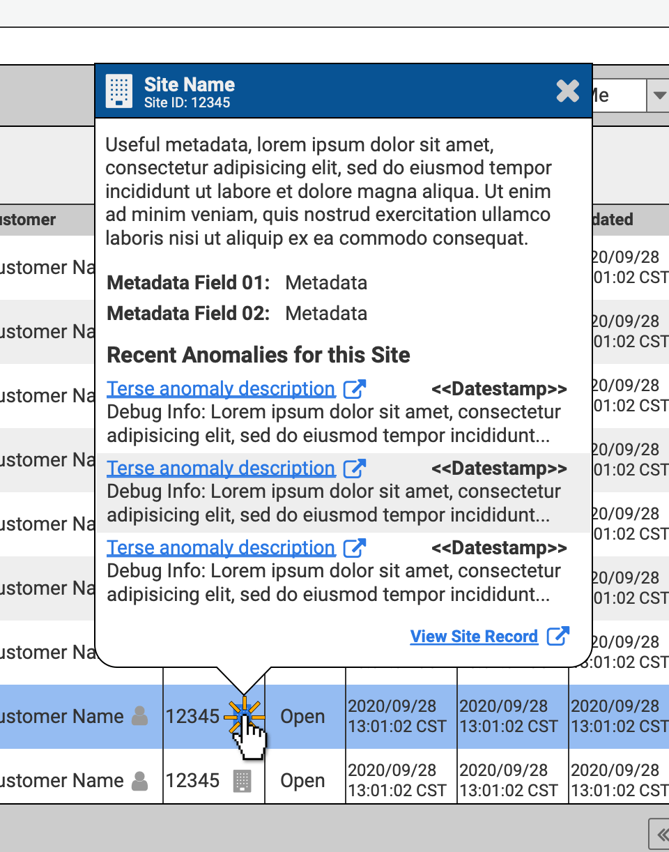

Everything at a Glance
To the left is a pared down set of wireframes from a point in the middle of the design process. In order to get the product to market as quickly as possible, some of the more involved features were trimmed to create an MVP (minimum viable product). To this end:
- In the cases where we had direct API access to the tools, our own UI elements were used to create a custom tailored experience to view and manipulate that data.
- Where convenient webhooks were not available, we settled for iframing the relevant parts of the external tools.
- Even with these limitations, the analyst can quickly gather all needed information for approximately 80% of anomalies.
There were a few more iterations before the initial designs were handed off to development to be coded. However, I departed both the company and project immediately after.
Conclusion
EVEN A KNOTTED MESS CAN BE ELEGANTLY UNTANGLED
While I was not around to find out if any of the business outcomes were officially met, I can say that the analysts who were poised to use the new interface were extremely happy. This was one of the most complicated and satisfying projects I’ve worked on in a long while and I’m happy to say that even though I won’t see it come to fruition, I’m confident that it is a tremendous improvement over the existing system.
I am overall happy with where I left the project. It started as an absolutely overwhelming mess of windows and ended as an elegant experience with clearly defined interactions, metrics, and goals.
Case Studies
Check out the case studies below
or visit my full portfolio for additional UX and non-UX related work
Sphera – Laying the UX Foundation
Leadership, Administration, Technical Writing, Research, Wireframing, & Prototyping
How I laid the foundations for a robust UX department by building a team and creating a UX framework, style guide, and design system.
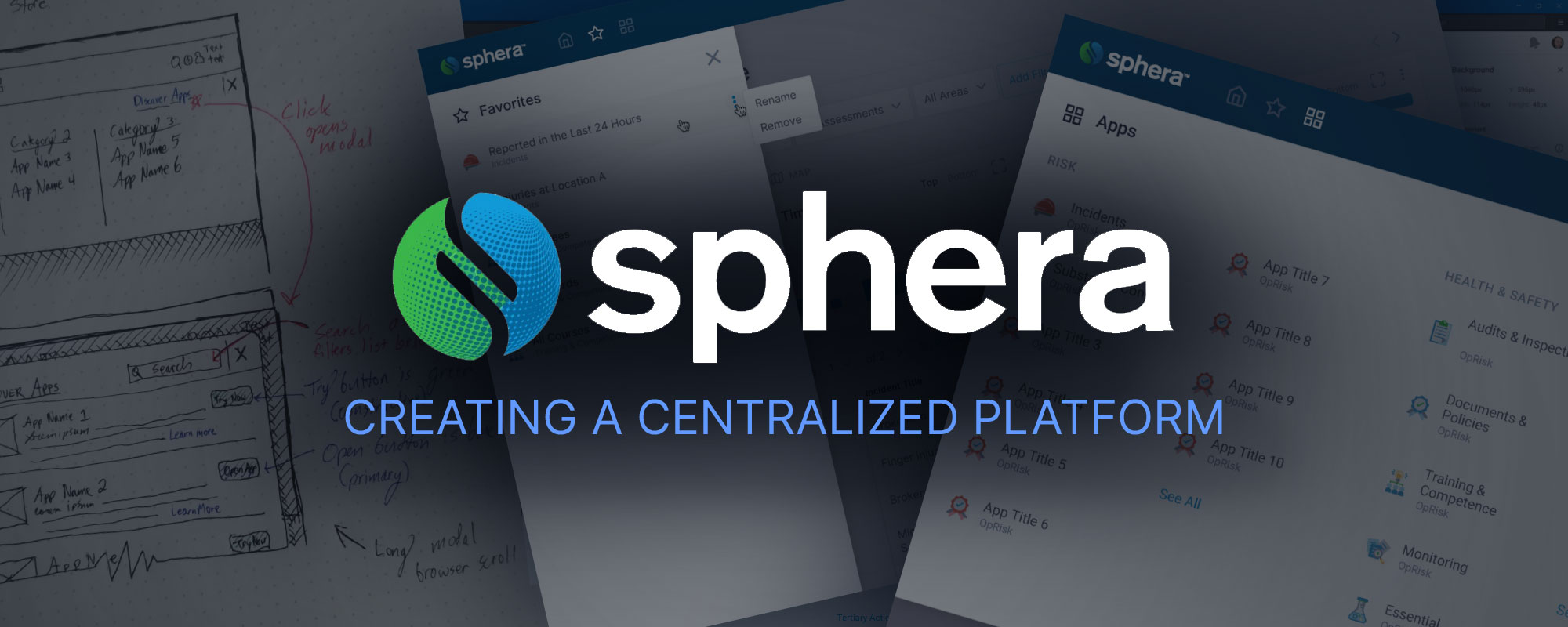
Sphera – Creating a Centralized Platform
Leadership, Research, Wireframing, & Prototyping
Working from the design system and foundations laid here, I lead my team to create a central platform to unite all of our disparate product offerings in the cloud.
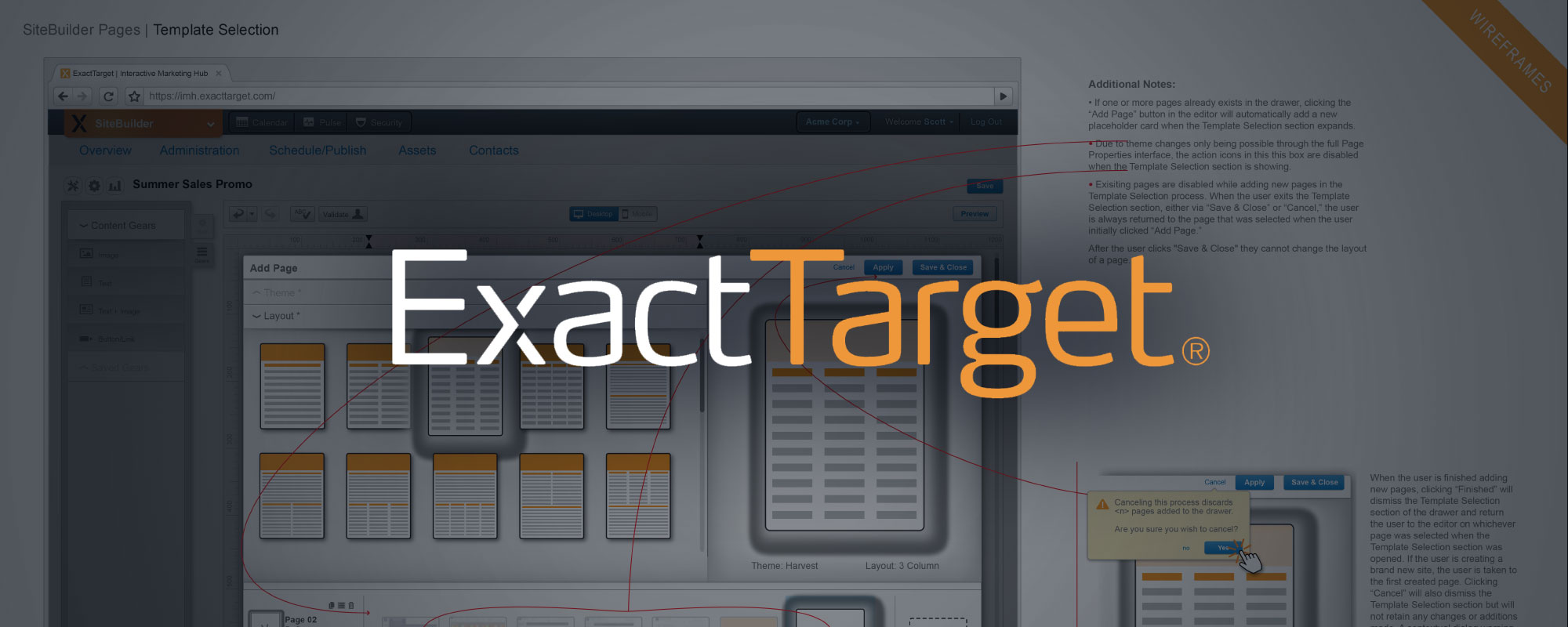
ExactTarget – Site Builder App
Research, Wireframing, Prototyping, & Teamwork
As part of a well-established team with a robust design system, this case study showcases my portion of the interaction design and creation of a website builder app from ideation through prototyping.
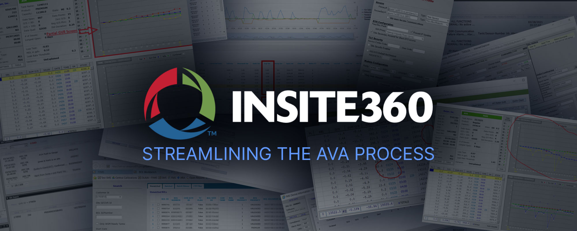
Insite360 – Streamlining the AVA Process
Research & Wireframing
Wrangling a suite of tremendously complex business products to play nicely together including defining metrics and business outcomes as well as designing an elegant unified cloud based experience.